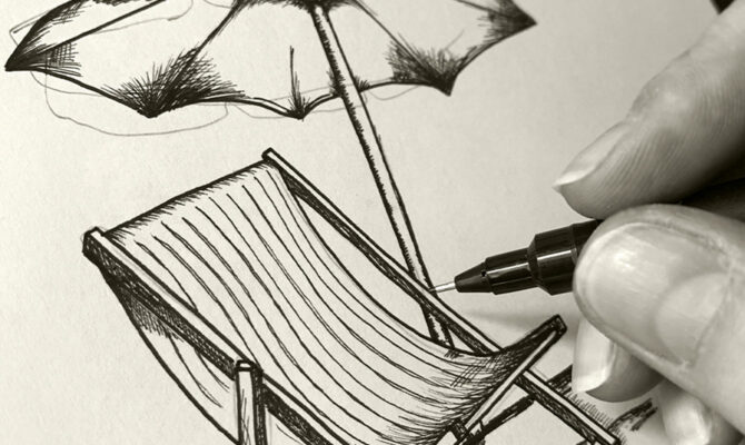
Why
Company Biography
Why is an independent strategic design consultancy operating out of London since 2013. Comprised of researchers, strategists, designers, writers, and developers, we are an agile and cohesive team who love to collaborate and innovate.
Our human-centred approach considers both brands and their audiences, offering a unique combination of user research, strategic thinking and creative problem-solving. By putting people at the centre of our processes, we have consistently helped brands create meaningful experiences for their customers.
From start-ups such as Matrix Health & Care, Jack Fertility, James Eadie, and The Run To, to established brands such as Anchor, Barclays, Nesta, and British Council, we support our clients with everything from branding and strategy to product and service development.
The relationships we build are long term, based on mutual respect and a genuine desire to see businesses thrive.
Discipline
Digital, Graphic, Research
Location
Greater London
Employees
5-10
Work showcase
MR
Anchor is the UK’s largest not-for-profit provider of care and housing for older people. They asked us to create the visual identity and positioning for The Chapters, their new independent living retirement development.
The target audience for independent living is niche—for those over 55 who have no care needs, are autonomous, and have the means or equity to buy their own homes. We began the project with a heavy focus on research, so that we could fully comprehend why residents would want to move to such developments, what reservations they may have, and the impacts on their lifestyles. In addition to constructing and sending out digital questionnaires to gather data, we visited Anchor’s existing independent living development. Using a combination of unstructured interviews and participant observation, we were able to gain authentic qualitative insights to inform our strategy.
The name, The Chapters, immediately conjured concepts around books and literature. From our research, we knew that the obvious notion of ‘new chapter’ wouldn’t engage our audience, so focused on pithier copy that expressed every insight we had learnt, as well as every logistical draw to the development.
We created hand-drawn illustrations in an etching style to reference the beginnings of chapters in old books. Coupled with the layout of the design, and titling each piece with a chapter number, our concept came to life as individual pages of a book on why moving to the development would be the right choice.
We designed and built The Chapters website, and accessible and responsive site housing information and contact forms, as well as email campaigns in Salesforce. We have created various print collateral such as brochures we designed as a series of mini booklets that were singer sewn to give a vintage feel. We also branded and created assets for the marketing suite that would explain the various accessible features of the apartments, making them suitable for older buyers.
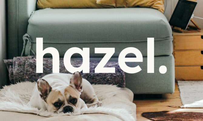
Hazel, 2023
Hazel is a property directory for older people, many of whom have retired, that aims to take the stress out of the logistics of moving. Whether they are looking to downsize, leave the city, or be nearer grandchildren, Hazel’s carefully considered filter allows users to find the most suitable home for them. Their specialist advisors also help with negotiations, packing, and moving to create a seamless experience.
It was important to the founders to have the right name for their offering—accessible yet professional, warm but authoritative. In naming and positioning the brand, we researched what was most important to prospective users and why such a service would appeal to them. In turn, the name Hazel, of a Hazel tree, was born out of the concepts of growth and putting down roots, reflecting the idea of a new lease on life. The tone of voice follows this concept, straddling the line of fun and youth, and informative and helpful.
We wanted the visual identity to be striking but palatable, grounded in our concept. The logo blends the shape of a house with tree branches that echo the idea of paths to be taken and the opportunities that moving can bring. The brand colours take inspiration from hazel trees throughout the seasons, also reflecting the different stages in the user’s own life. Our illustration style is directly informed by the graphic elements apparent within the logo, bringing greater consistency and brand recognition across all brand outputs and collateral.
Rented housing customer journeys, Anchor, 2022
Anchor, the UK’s largest not-for-profit provider of care and housing for older people, required customer journeys that showed the end-to-end journey for different types of customers throughout the process of becoming a rental resident, in order to improve their customer experience.
Through analysing the existing Anchor personas for rental enquirers and supporting research, we drafted initial journeys that detailed everything from the customers’ feelings and needs, to their touch point and communications choices. At this stage, there was already a lot of empathy growing for our persona’s and their journeys, as we could really understand their actions, thoughts and emotions.
To refine our journeys we conducted a workshop with the internal housing team that processes applications at Anchor. Their experience of actual scenarios, processes and hurdles helped us to flesh out the journeys and add more realistic details and insight.
The customer journeys allowed us to highlight any pain points in the process that may be experienced by both the customer and the internal team. This in turn allowed us to create actionable recommendations to remedy them and create a better customer experience.

Barclays, Accessibility Guidelines, 2022
Barclays is a global banking institution serving every conceivable demographic across the world. Such wide and varied audiences not only have differing needs, but different vulnerabilities and abilities. When the FCA published finalised guidelines for complying with accessibility and inclusivity, Barclays endeavoured to refine their own to meet them.
The key objective was to ensure that all products and services are designed to meet the needs of vulnerable customers, ensuring they don’t cause detriment. It was decided that thorough guidelines would be the most effective way of keeping product owners and designers to this objective.
We conducted a research audit to identify opportunities for considering vulnerability within product and service development, where we uncovered prevalent behaviours and the drivers behind them that can increase a customer’s potential to experience harm. These behaviours became the foundation of our guidelines as digestible and accessible content. We personified each behaviour with memorable illustrations and clear examples and created a carefully designed document that contained a wealth of information but did not overwhelm users. The clickable contents ensured users could navigate the document with ease and that it was hassle-free to refer back to.
User experience and accessibility rules can be difficult to digest when outlined properly and in-depth. Although we’d created the guidelines off the back of our extensive research, we wanted to also present them to the project team and those who would be using them day-to-day in an accessible and memorable way. We held a presentation workshop where we made each element of the findings and subsequent guidelines interactive: vulnerable behaviours were printed on playing cards; employees role-played personas; we played video testimonials from real customers; and we conducted a live audit of the website—gameshow style—through the lens of accessibility.